Getting Started
Before you start designing anything, consider what you need on the entry page:
- Is there a particular background image you need to include?
- Do you want to feature an image of the prize?
- Do you need to include your sponsor’s logo?
- Will you need any explanatory text?
- What is your call to action?
Next, consider the theme of the contest. Who is the target audience? What is the emotional appeal of this contest? After all, the colors and fonts you would choose for a rock concert ticket giveaway are going to be very different than the ones you would choose for a holiday sweepstakes.
Choosing a Background
Start by choosing an eye-catching photo to use as your background or header image. You want an image that is clear, in focus, and related to the theme of your sweepstakes. Think again about what your prize is and who the target audience for the contest is.
If you don’t have a photograph you can use, come up with a color or pattern to use in the background that will communicate the mood of the contest without being distracting
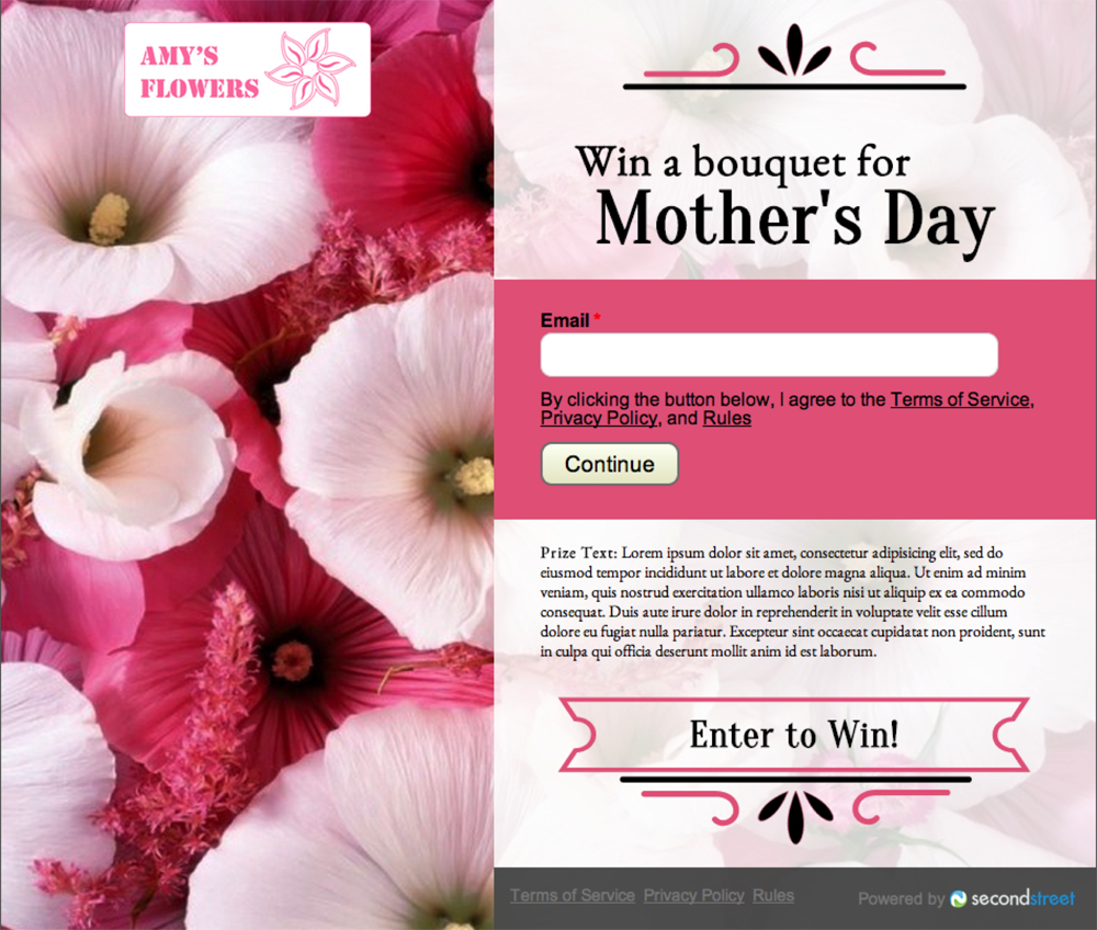
For a Mother’s Day contest being sponsored by a local florist, we have chosen a simple background image of pink and white flowers. Part of the reason this image will work so well as a background is because it doesn’t have one single focal point.

Choosing a Color Scheme
Once you have selected your background image, come up with your color scheme by pulling colors from it. Instead of going with the most prominent color in the image, try pulling out a secondary color that will stand out more.
If you are including an advertiser’s logo in your design, look for colors that your background image and the logo have in common in order to pull the entire design together.
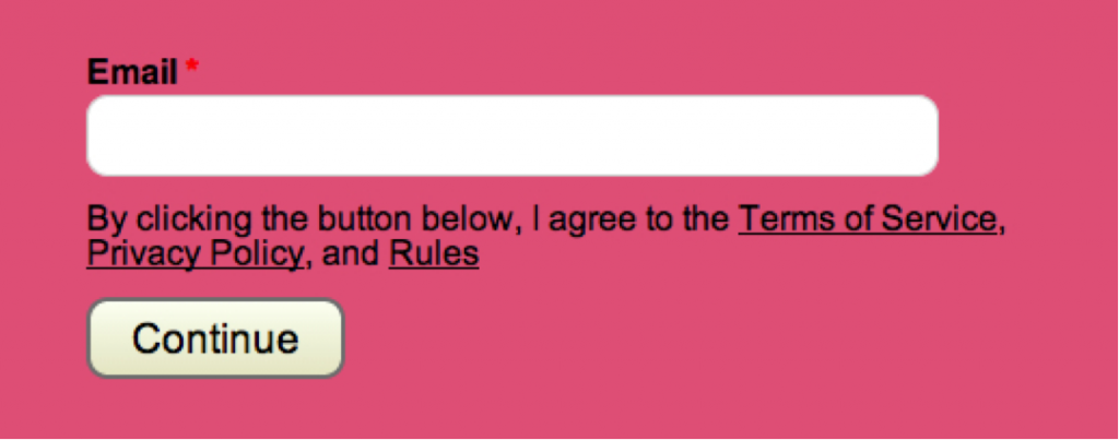
For our Mother’s Day giveaway, we chose a soft pink background that pulls from the pink accents in our image:
Choosing the Header Text
Now that you have a background image and a color scheme, it’s time to choose your header text and call to action. Ideally, your header text will convey the whole point of the contest in about 6 words. For our Mother’s Day giveaway, the header will say “Win a bouquet for Mother’s Day”. Since it’s a simple enter-to-win contest with a single prize, the call-to-action will simply be “Enter Now!” However, you can also use this call-out text to highlight an aspect of the contest that makes it unique, such as an incredibly valuable prize package or multiple chances to win.
Designing the Header Text
Your header text is the perfect place to have a little fun and reinforce the theme of your contest. It needs to be easy to read, but since it’s larger than the other text on the contest page, you have a little more leeway in the types of fonts you can choose.
As always, start by thinking of your prize and your target audience. Do you want a sporty font? An edgy font? A feminine font? If no obvious theme presents itself, look back at your photograph. If there is a lot going on in your image and your text will be right on top of it, choose a simple, bold font. If your image is more muted or if your text will be over a solid background, you can be a little more playful.
For our Mother’s Day giveaway, we chose a simple black serif font because the text was going to be overlayed over the very busy flower eye-catching busy photograph and we didn’t want the font or color to compete with that – or with the whimsical ornamentation on the contest page.

Choosing a Secondary Font
Since your explanatory text is going to be much smaller than your header and call-out text, you are going to want to use a font that is legible in small sizes.
While the header text covers the need-to-know information about the sweepstakes, the explanatory text is your chance to give more detail about the prize or how the contest works. Do your best to keep this section short though, as a contest page that is cluttered up with fine print might be more intimidating for your audience.
Getting Feedback
Once you finish your design, take a minute to get some feedback from people who haven’t been working directly on it. Ask them if it looks like a sweepstakes they would want to enter and whether they clearly understand what the contest is. Be sure you give yourself enough time to make any edits.
Even though I have presented these design tips as a series of steps, the design process is not linear. Feel free to work out of order, to go back and make changes, and to do whatever you need to do to make your sweepstakes look as fun and professional as possible. Remember, this contest is a representation of not only your company, but your advertiser as well. It’s always worth the extra time to make it look beautiful!
